NEWham
An app designed for better hygienic environment and to bring the community together (collaborated with London Borough of Newham)
problem
Newham is a young, vibrant, and passionate community. As the borough continues to grow and develop, the council faces a number of challenges, one of which is street cleanliness. Beyond this, a key priority for the council is to better integrate residents and ensure they feel at home, fostering a strong sense of belonging within the community.
solution
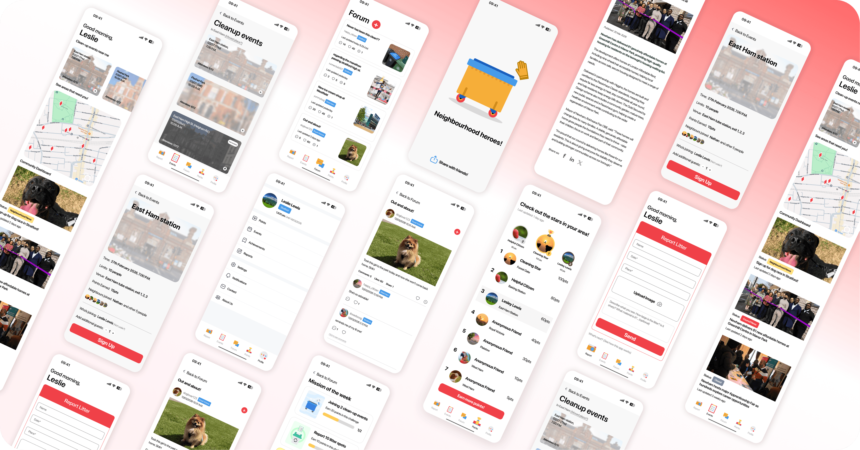
I developed a clean-up and reward programme that draws on psychology and behavioural insights to encourage participation. Residents can sign up, report refuse in their local area, and join neighbourhood clean-up teams as part of their daily lives. In return, they receive both psychological rewards, such as a sense of contribution and community and financial incentives.
my position
Lead UI, UX designer, visual designer
year
2022-2023 (Re-edited in 2026)
timeframe
4 months
tools
Figma, Adobe XD
team
Siqi D. Y., Agatha A., Xiao Z.
Project highlights
Discovery
Who are we designing for?
◉ What's the problem?
We spoke to the staff of London Borough of Newham, John, about the situation they want to change and things they've started and see effectiveness on.
Here are some things they've done and was somehow effective
Local workshops (Youth Empowerment Weekly Programme, etc.)
Community consultations (Newham Co-create)
Local organisations outreach
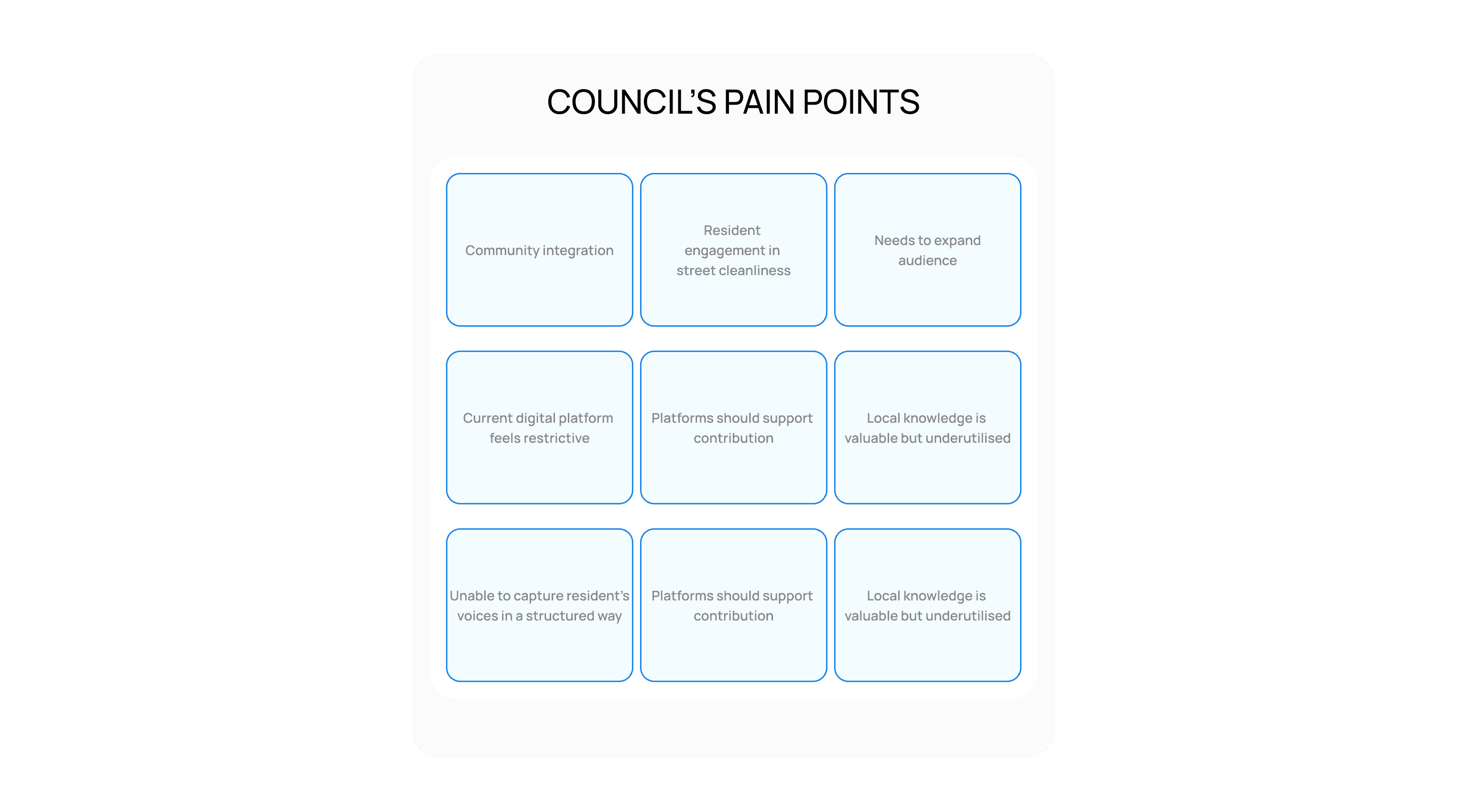
Although these activities are engaging, they do not always directly contribute to improving street cleanliness, which is currently a key priority for the council. From an enforcement perspective, the Newham council has issued fines in the past; however, it prefers to motivate rather than punish. What it is ultimately seeking is a platform that brings people together while also making a tangible impact on keeping the streets clean.
◉ Stakeholder Interview
It's important to know what everybody thinks. Thus, we conducted a series of informal interviews with residents, shop owners and online community members in Newham to understand how people currently engage with their neighbourhood and what motivates them to contribute to local initiatives.
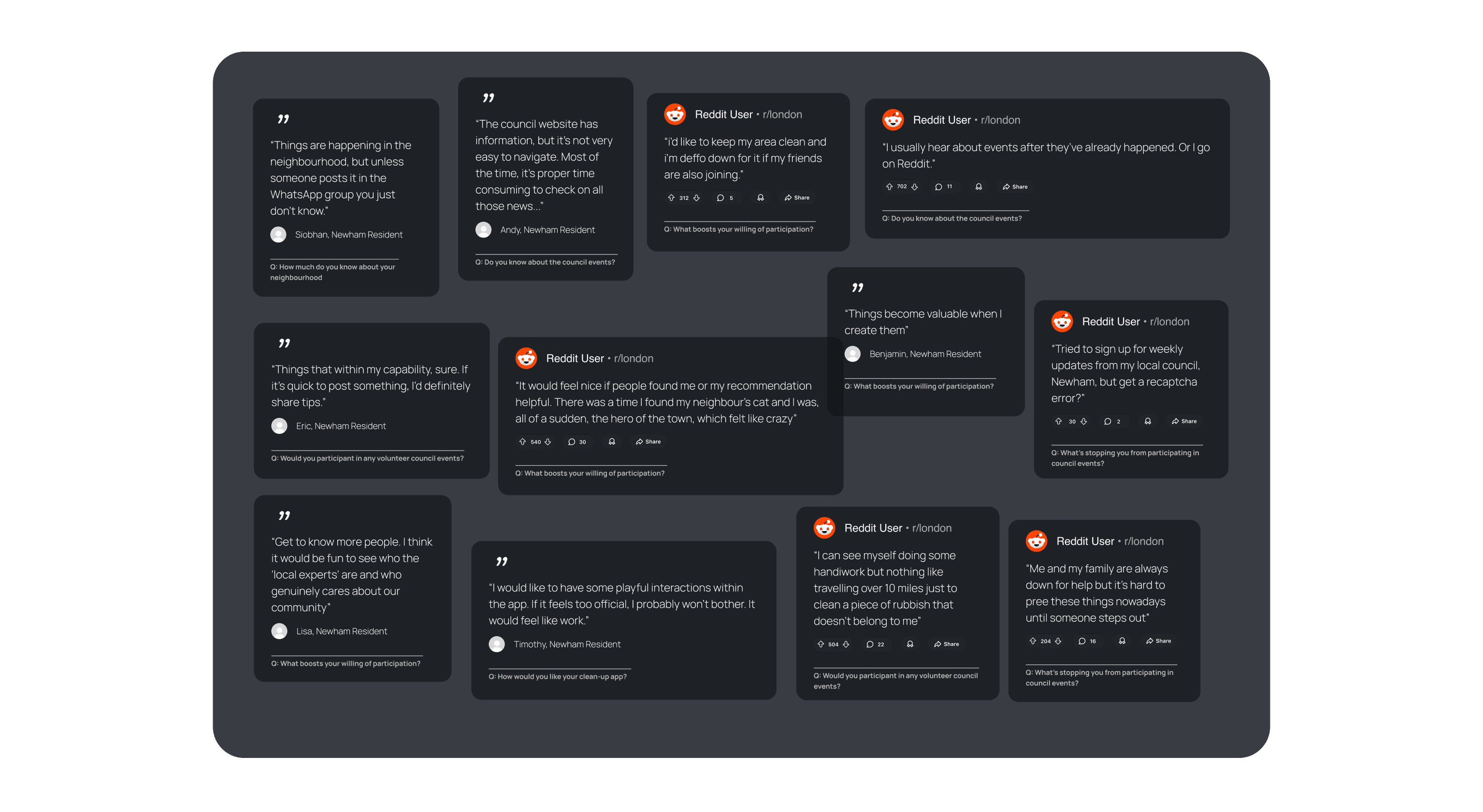
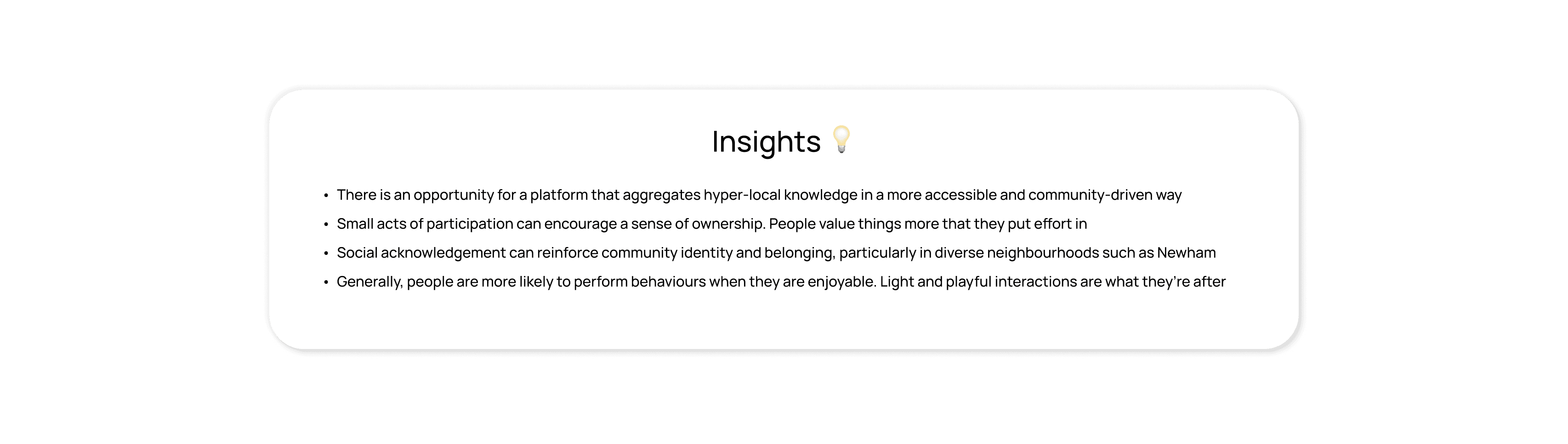
Although most people are willing to contribute to the environment, there are 2 problems they're facing:
Don't have the information about the activities
Don't have enough energy for a complex problem outside of personal duties
To turn that into opportunities, we could say:
People would participate for rewards, and social rewards is one of the best ways to motivate them
If the clean-up activities are more fun-driven over mission-oriented, people would more likely to join
◉ Into Newham
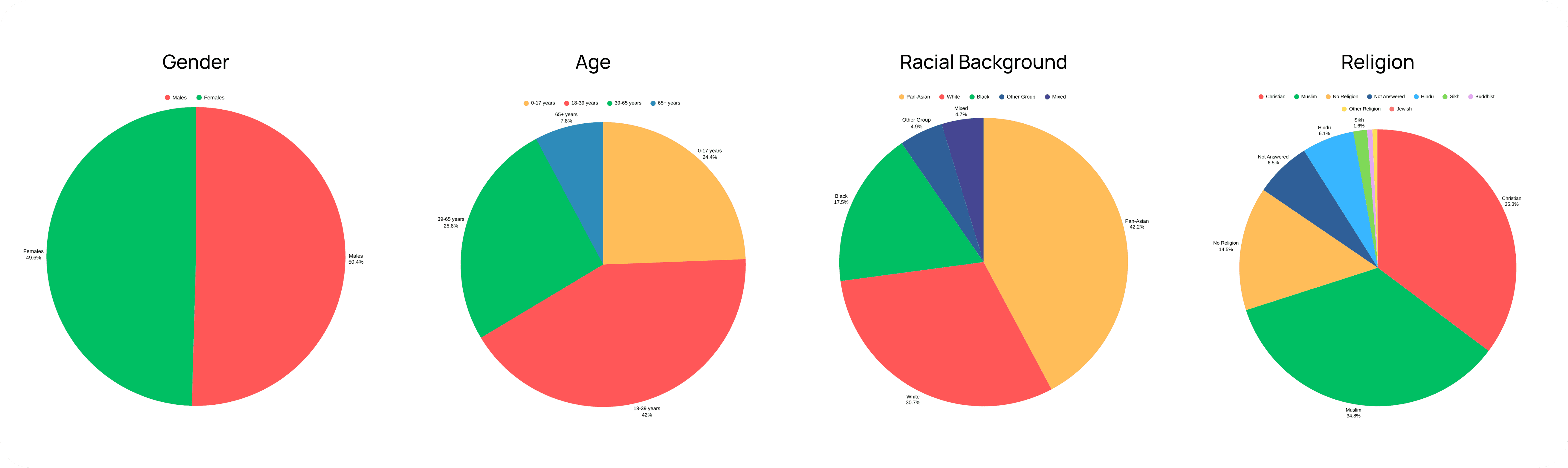
Newham is a dynamic and diverse community, home to people from all over the world. With a median age of around 31–32- significantly younger than the UK average, the borough has a strong presence of younger generations. It is also highly multicultural, with approximately 42% Asian, 17% Black, and 31% White residents. This diversity is reflected in its linguistic landscape, with only 65% of residents reporting English as their main language. With a population of around 370,000 and rapid growth over the past decade, fostering integration remains a significant challenge.
Secondary Research
◉ What does psychology say?
Here are some tricks I found useful / playful during the research…
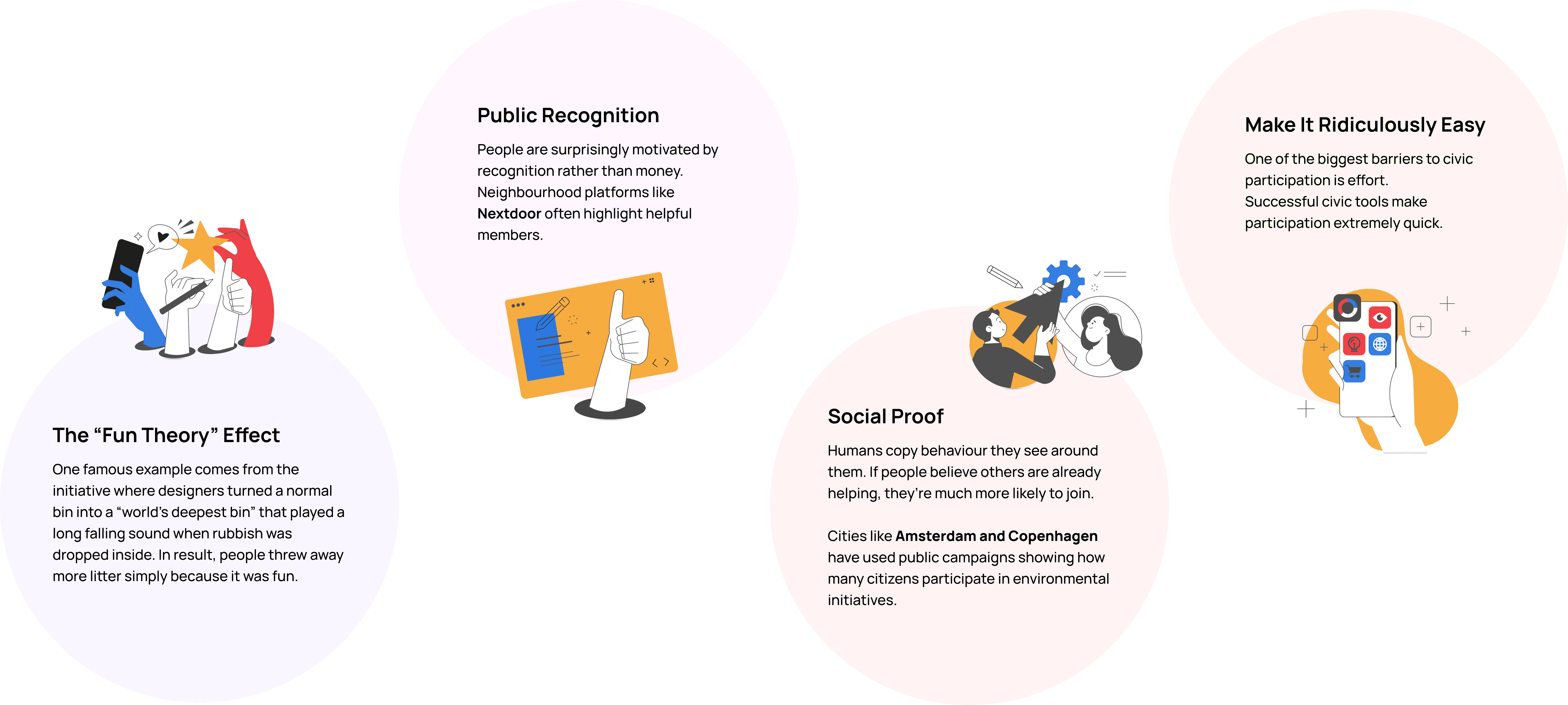
◉ The IKEA Effect
The IKEA Effect is a useful idea for your project because it explains why people value things more when they help create them. The term comes from the furniture company IKEA, where customers assemble their own furniture. Even though the work is minimal, people feel more attached to the final product because they contributed to building it. Researchers in Behavioural Economics found that people often overvalue things they helped create, even if the effort was small.
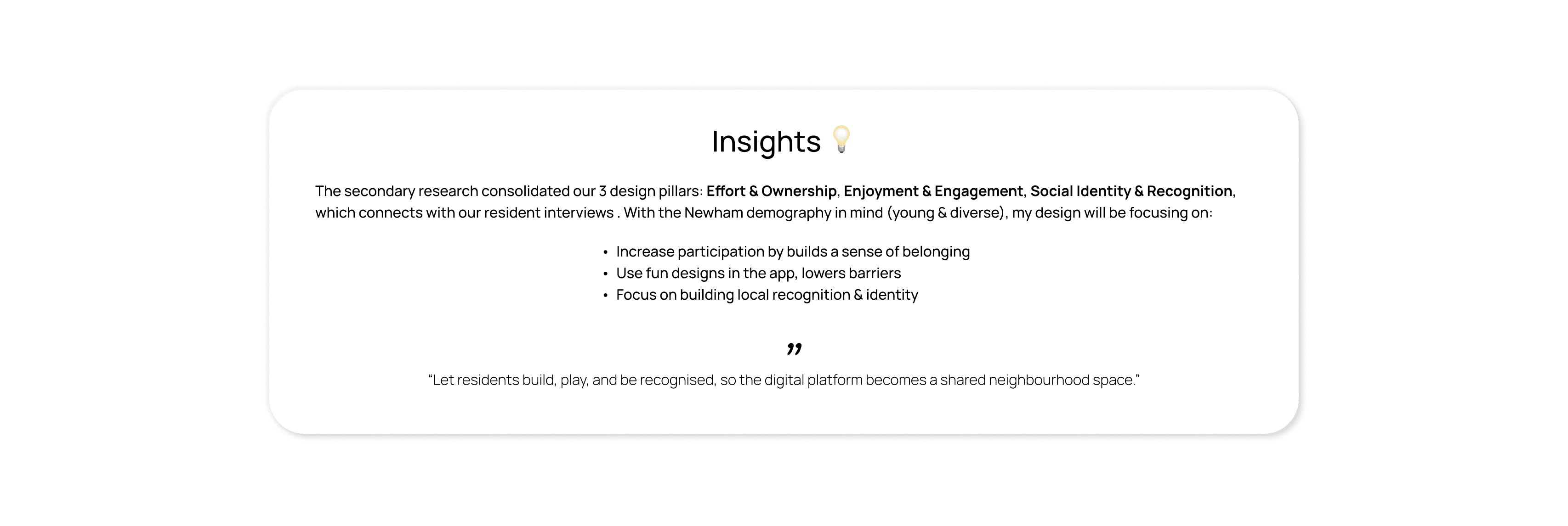
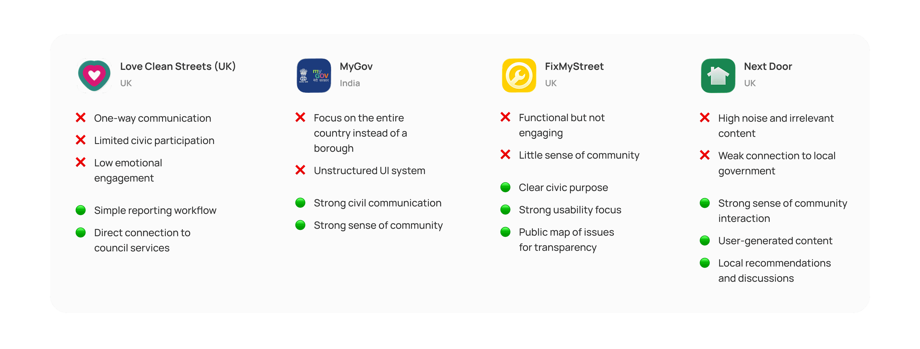
◉ Competitor Analysis
I started off by monitoring direct and indirect competitors that provide similar concepts to my product: social integration, community news and litter report & cleaning. By doing so, I was able to hack into the definitive factors of what makes a successful civil app.
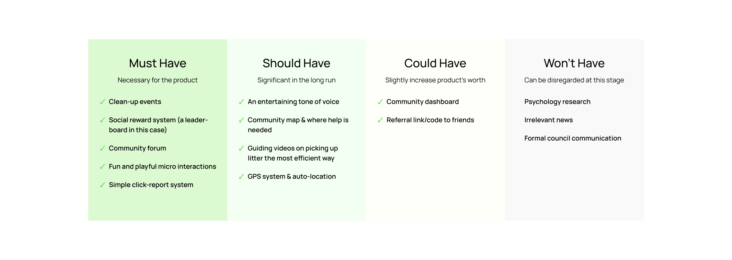
◉ Prioritisation Matrix
Here is a 2x2 prioritisation matrix to categorise the priorities based on the interview & research. From here, I decided on the Minimum Viable Product (MVP) features for the product.
Ideation
◉ Crazy 8s
After the research and a few possible MVPs, I gave myself 1 minute for some crazy 8s tasks to sketch up all the ideas in the shortest time possible. This task breaks down a plain white paper into 8 sections, and the participants are expected to jot down ideas quickly.
◉ Hybrid Card Sorting
We gathered a few potential participants of the NEWham app and had them sit down for a hybrid card sorting session. They were assigned a few categories at the beginning of the session, and they'll utilise the sticky posts to find out what navigation labels make sense and what feels grouped together naturally. Here's what we landed at the end.
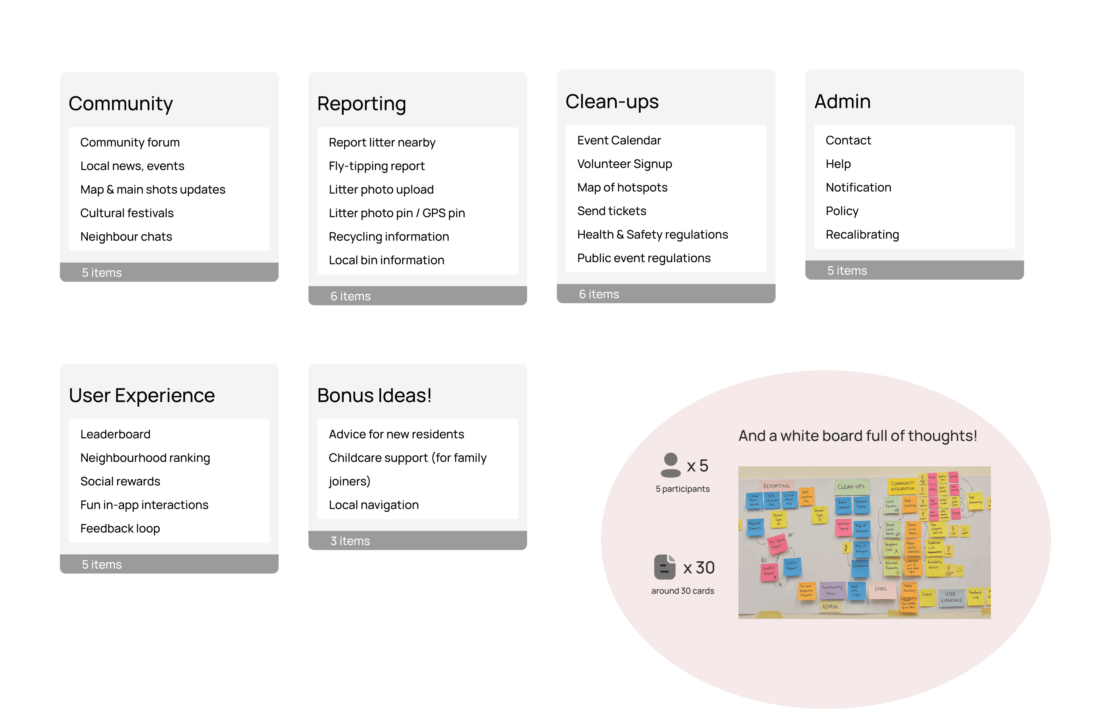
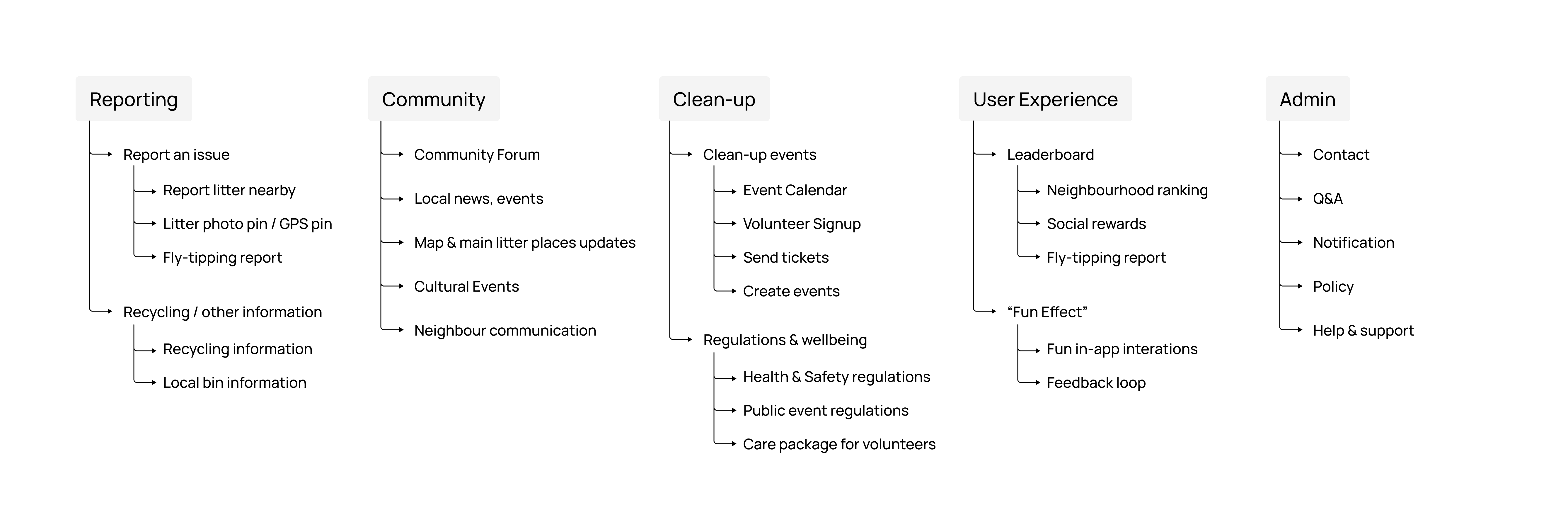
◉ Information Architecture
Based on the card sorting results, I created this information architecture to meet users' expectations.
Prototyping
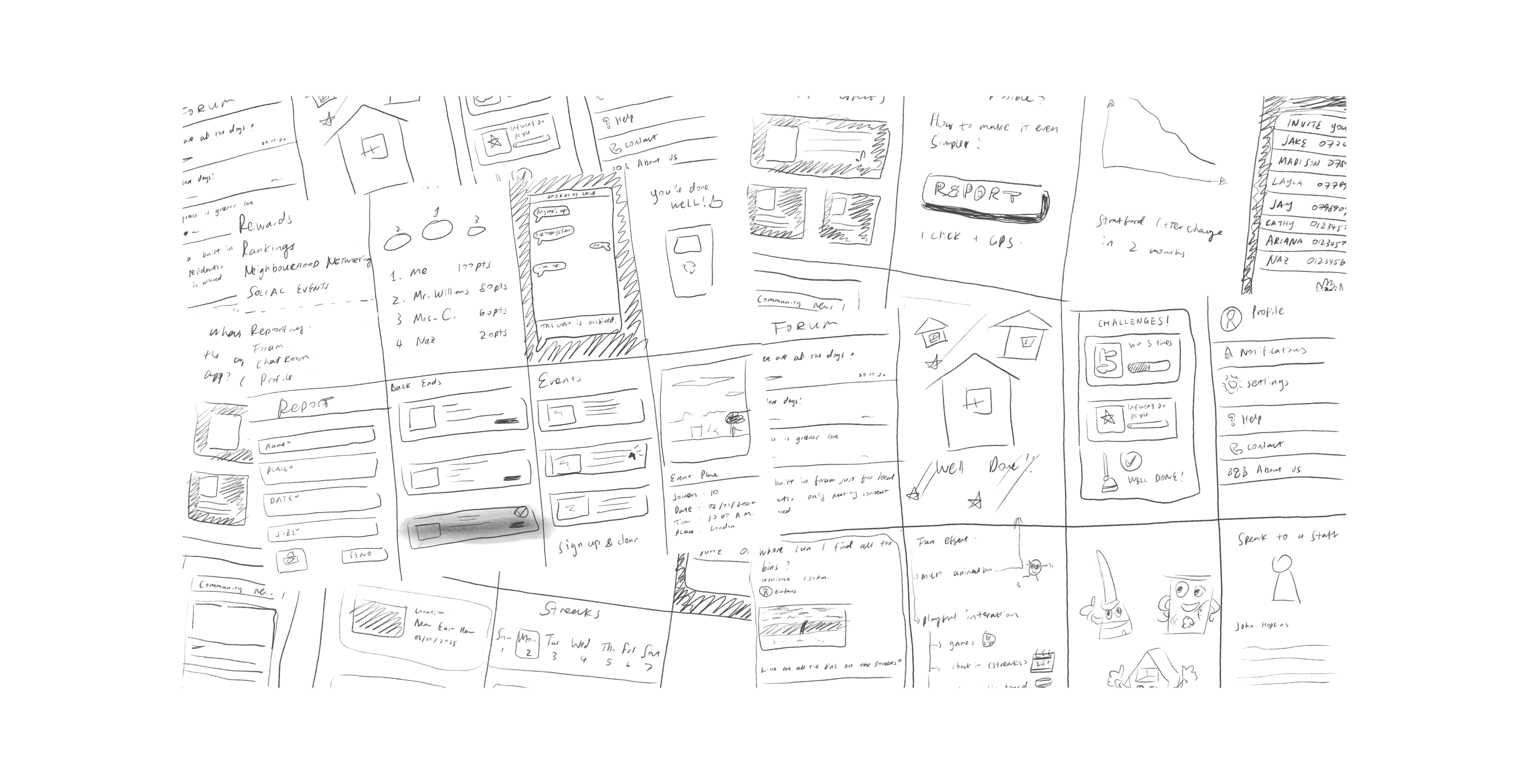
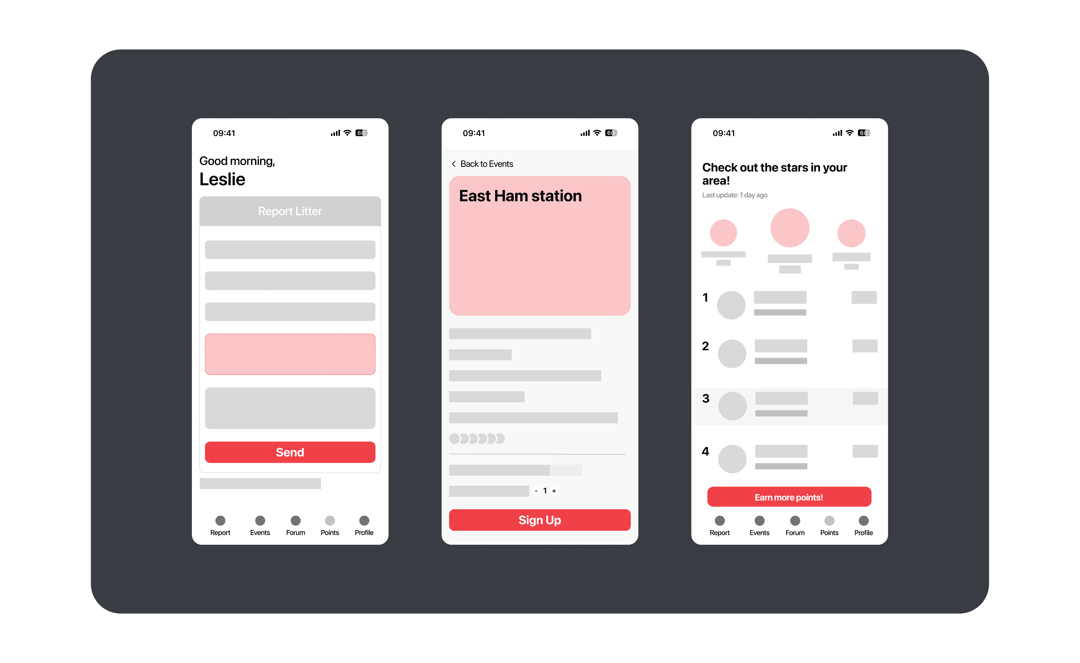
◉ Low-fidelity Wireframing
The most important action a new user could take is to report litter and participate in an event. This is our primary flow. I charted a basic version, taking into consideration what's needed from the Admin side, and specifying a clear happy path, which would allow me to start structuring the content within the app.
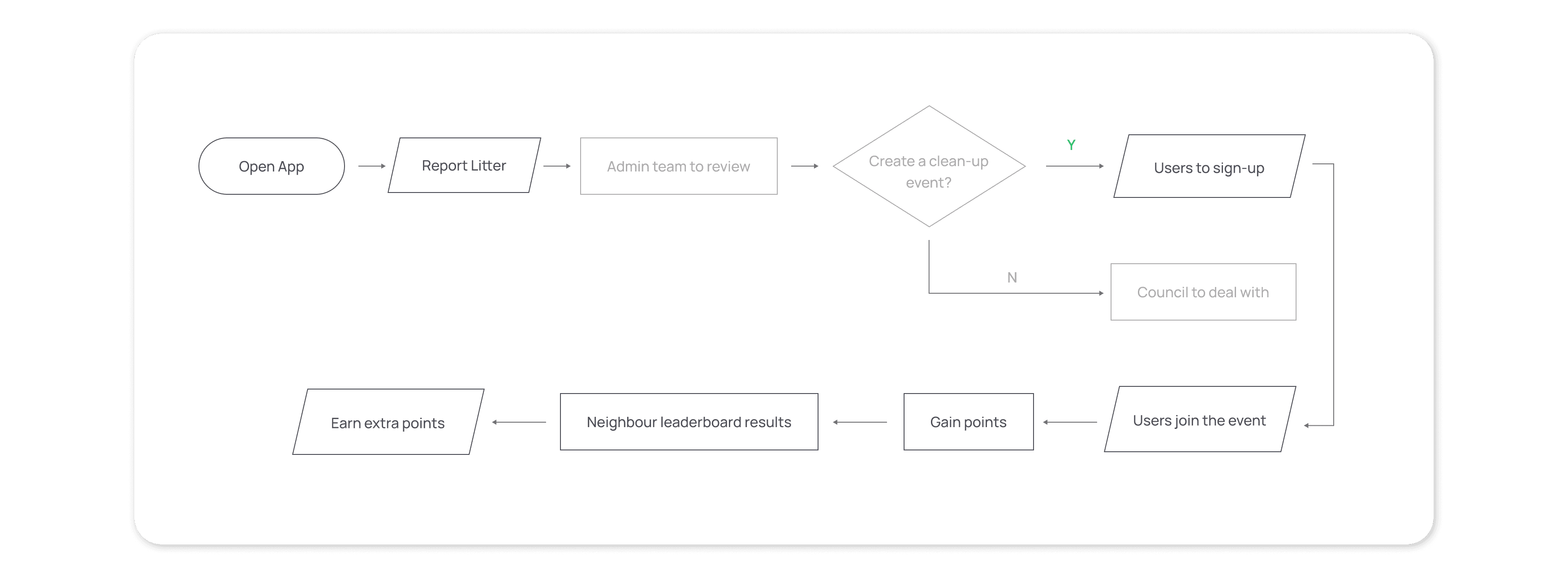
This low-fidelity wireframe was to represent this flow, and we later on conducted a series of useful testings out of it.
Exploration
◉ Simplify everything
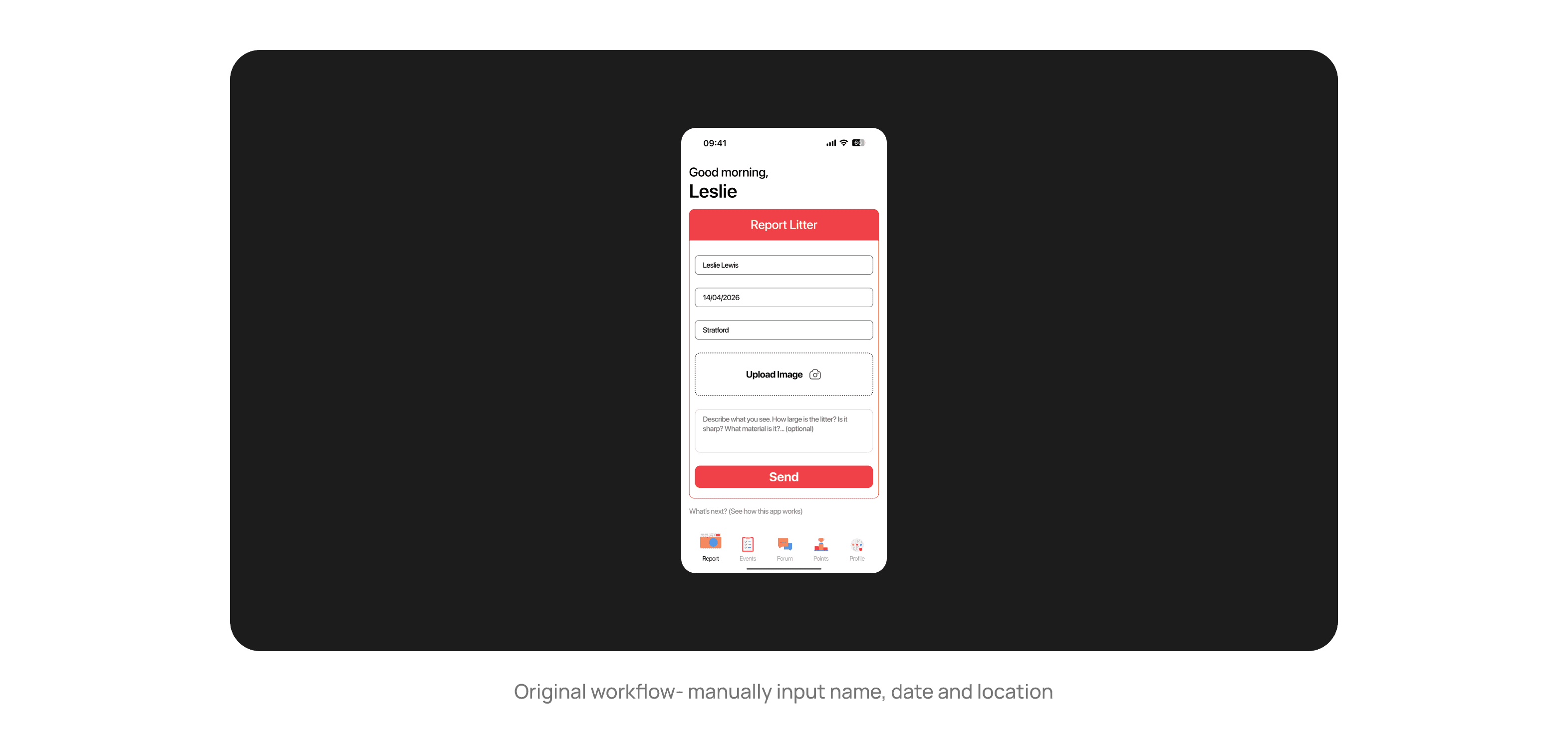
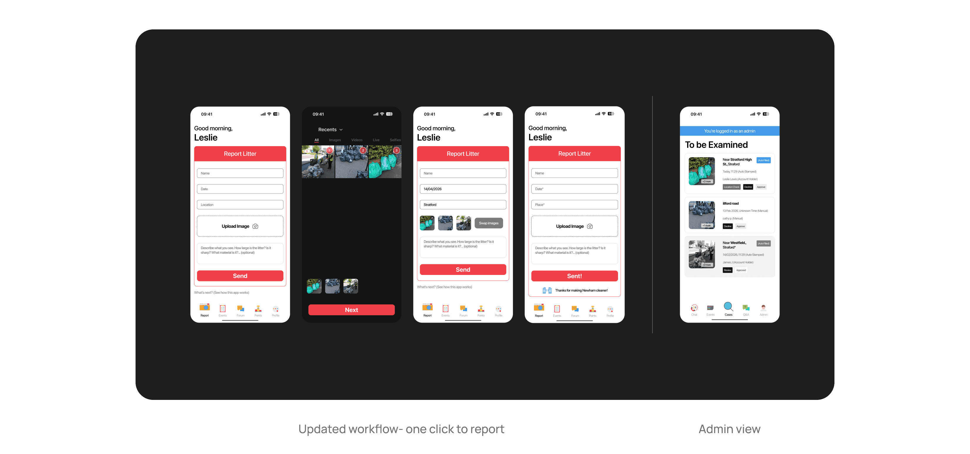
Throughout the making, we really wanted to see how simple we can make this app to be. What if we can make the "one-click" reporting happen? Is that really possible? Will it add much burden to whoever is reviewing the cases?
Our workaround was to use GPS location service and time stamp so users won't need to manually input their names (the app detects account holder automatically), date and location.
A/B Testing
◉ Make it pop!
In order to further simplify and streamline the report process, I tested both screens below and see which would lead to more reports:
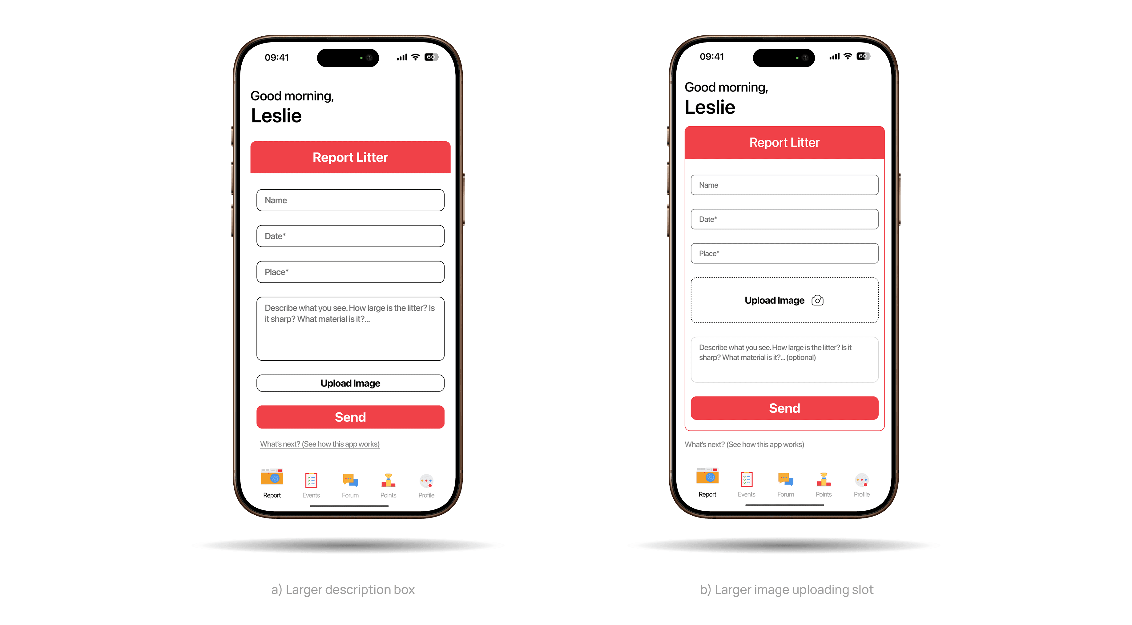
We tested on 15 people to use both screens. 9 out of them found b) was much easier to use. Here are the written feedback:
Screen with the Upload Image button in a prominent position received more reports
Most user say that they don't mind filling the name, date and place boxes, which was different than what we had expected
I was interested in why a small button change could result in such a big difference. I later figured it out that it has to do with how the interaction works.
Interaction
Similar size task boxes - Cognitive load ↑
Obvious task target - Cognitive load ↓
… and supported by a study as well.
“Users often leave web pages in 10–20 seconds, but pages with a clear value proposition can hold people’s attention much longer.” — Nielsen, J. (1993). Usability Engineering.
“The time it takes to make a decision increases with the number and complexity of choices.” — William Edmund Hick & Ray Hyman, Hick's Law
Once the rule is clear, I applied this finding on other screens as well:
What I did:
Put Call to Action button in the most eye-catching colour
Isolate the prominent messages with secondary messages
FUNctionality
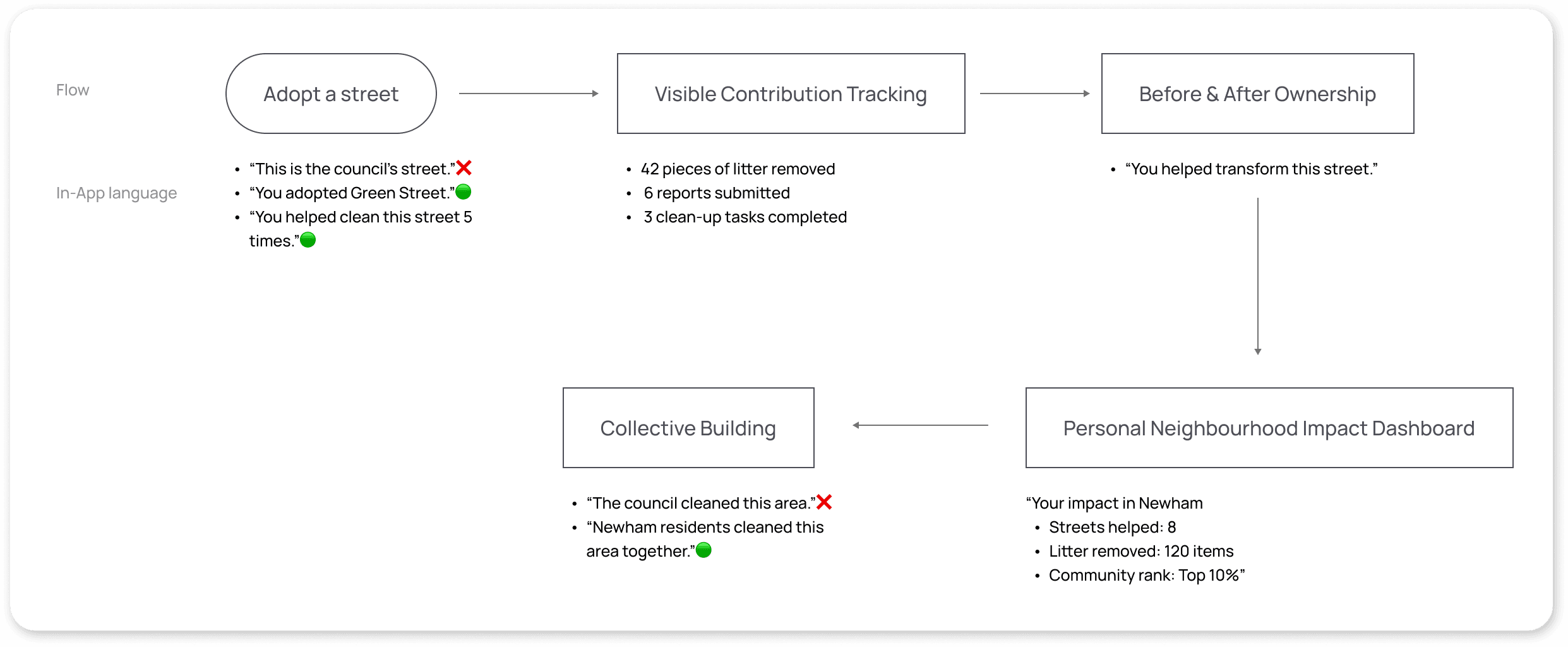
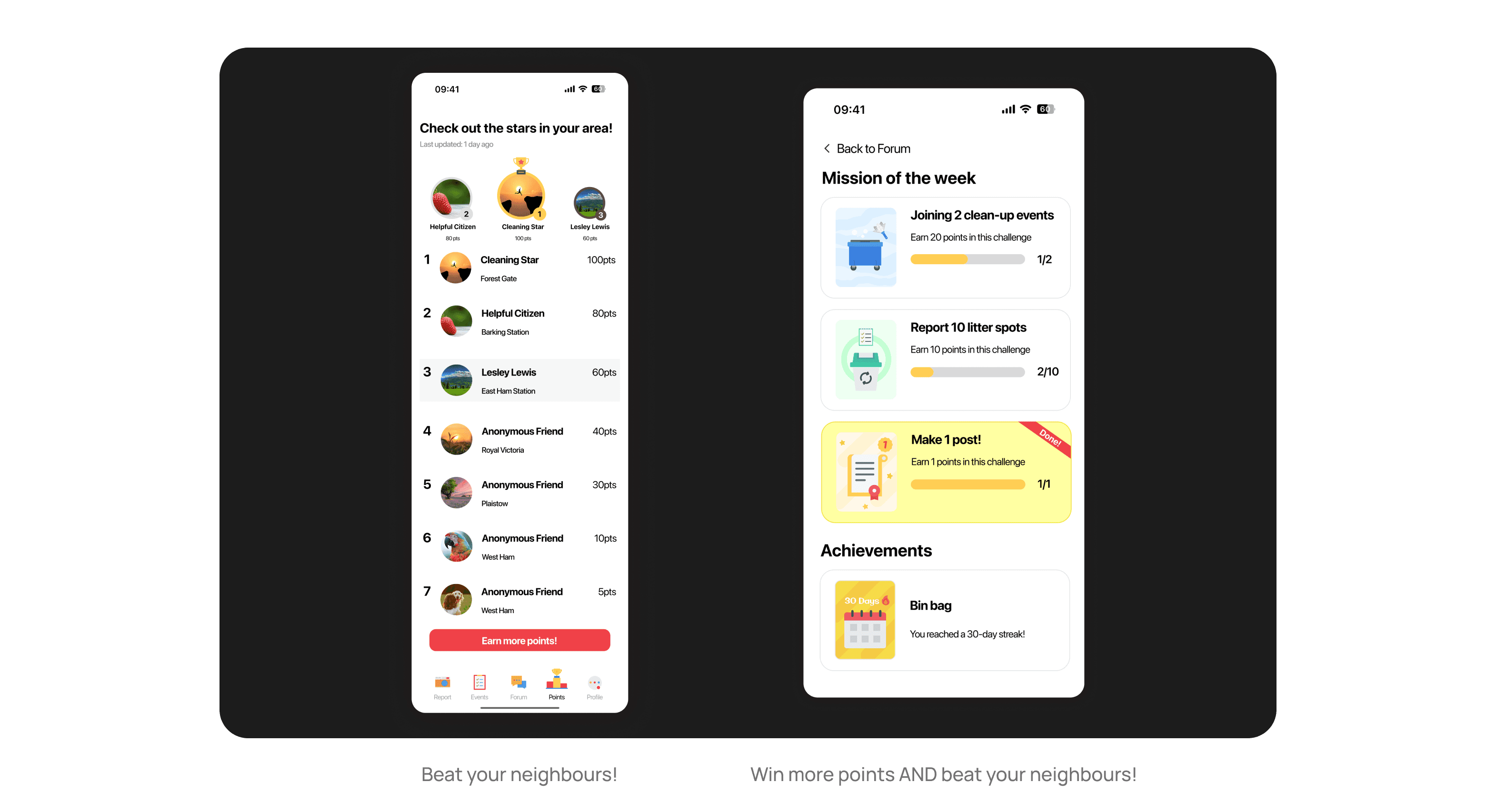
◉ Neighbourhood Leadership
Based on the research "Fun Effect" and how social reward encourages people's action, I designed a neighbourhood leaderboard system. Newham residents will earn points across varies activities, from reporting to joining a clean-up event. There are also missions awaiting, weekly or monthly.
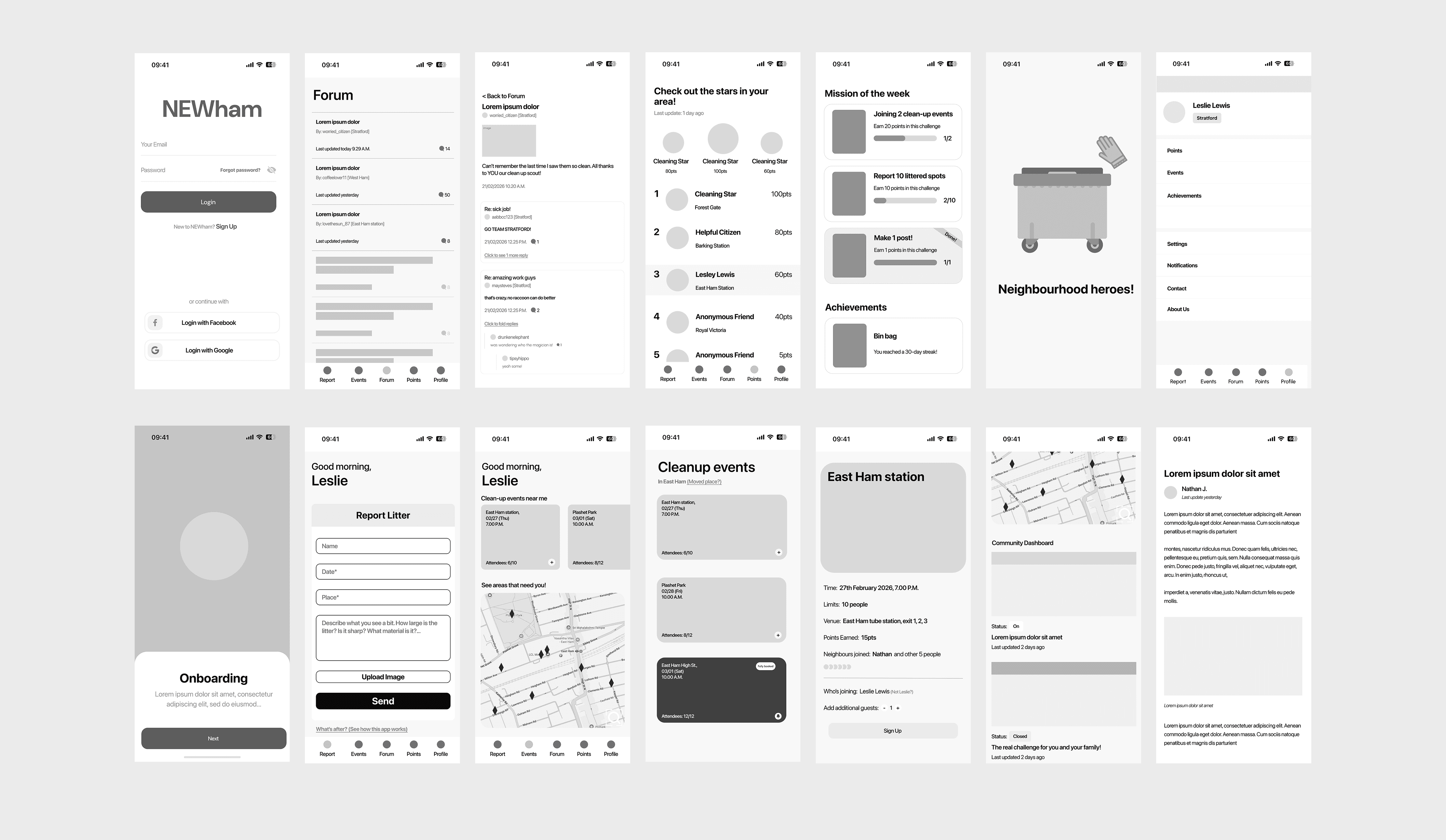
Final Product
Summary
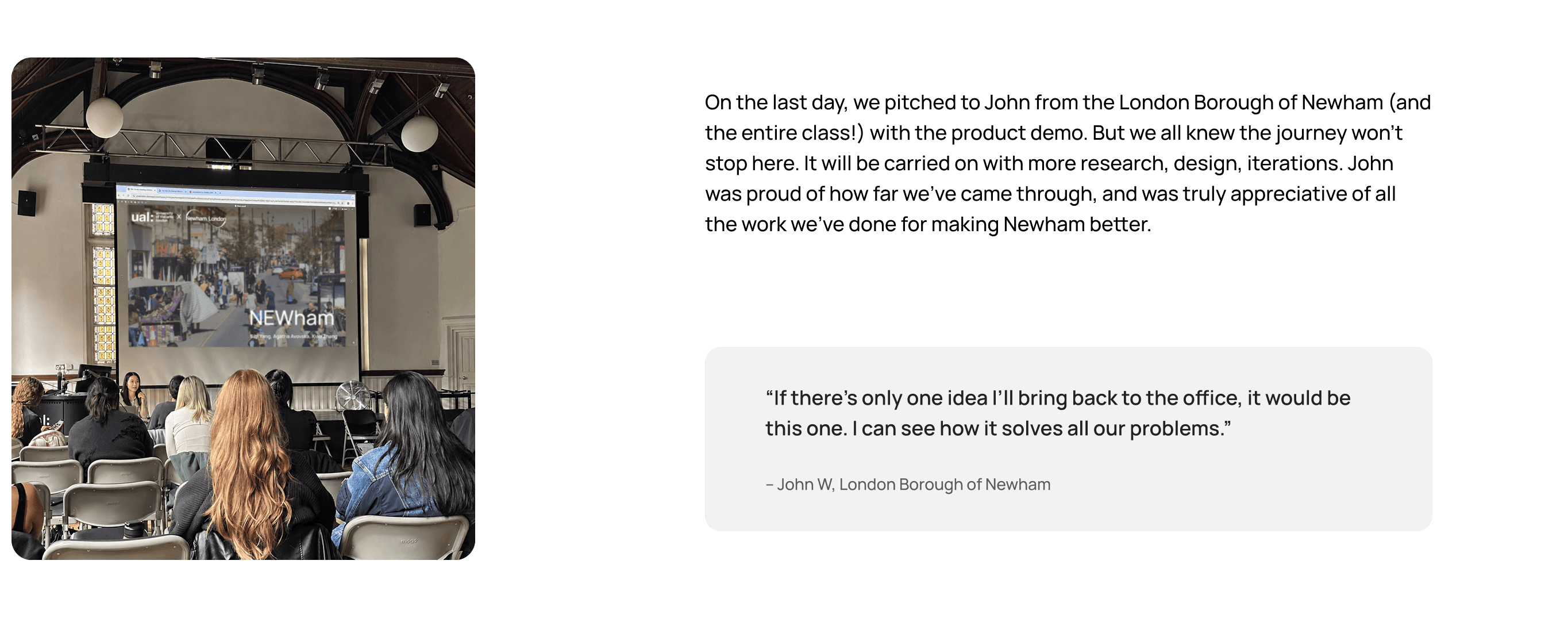
Presentation Day!