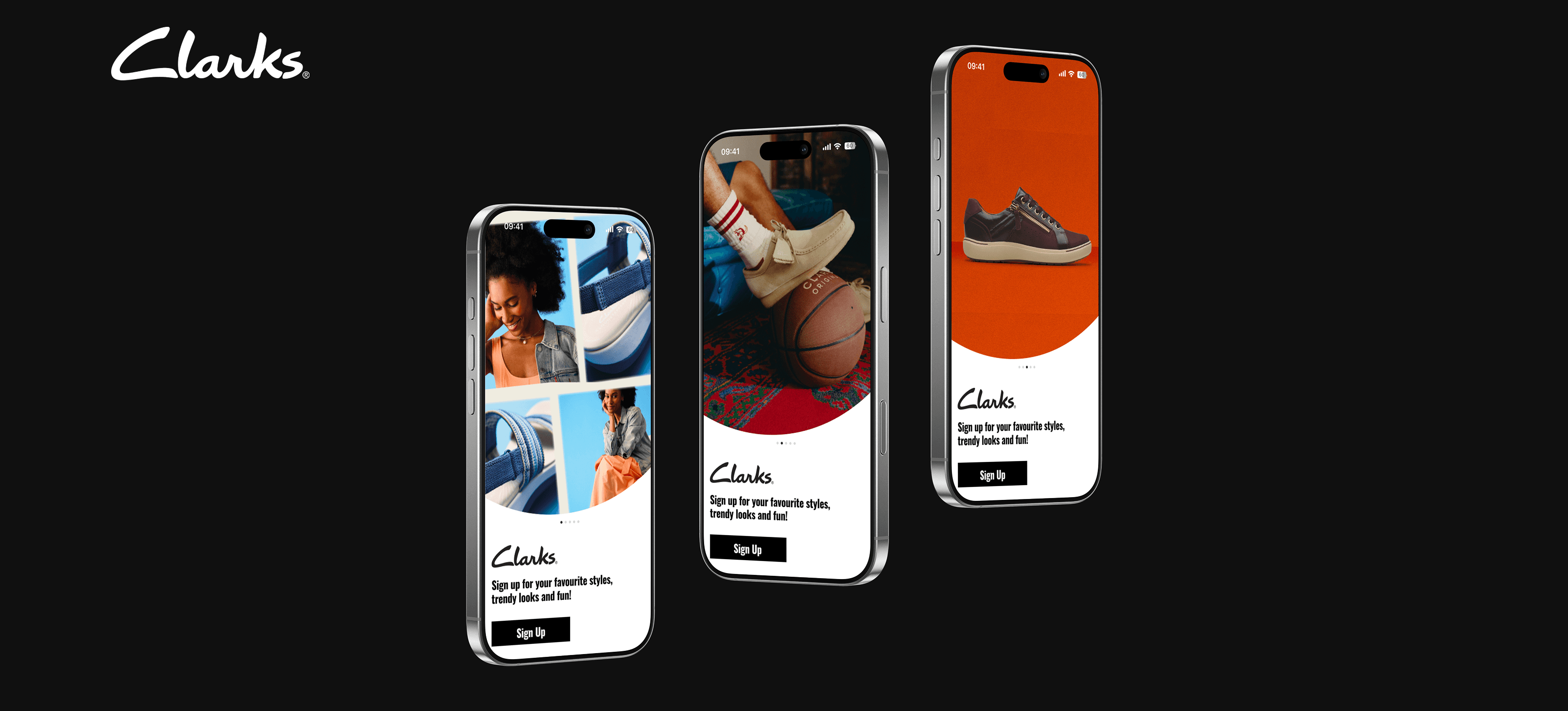
Clarks Mobile App
An app designed for the most classic & trendy English footwear brand featuring customer community group and influencer content
problem
Clarks’ current website experience has limitations in personalisation, mobile interaction, and customer engagement, highlighting the need for a more seamless mobile platform.
solution
This project proposes a mobile app that introduces personalised features, user-generated content, and a customer-led styling community to create a more engaging and future-facing shopping experience.
my position
Product Designer - Interaction Design, Visual Design, User Flows, Rapid Prototyping
year
2025
timeframe
1 months
tools
Figma, Framer
team
Individual Project

Click here to have fun with the prototype <<<

Clarks aims to develop a mobile app that expands its customer base while reinforcing the brand’s identity as timeless, ageless, and unisex.
However, several limitations in the current website experience highlight areas for improvement:
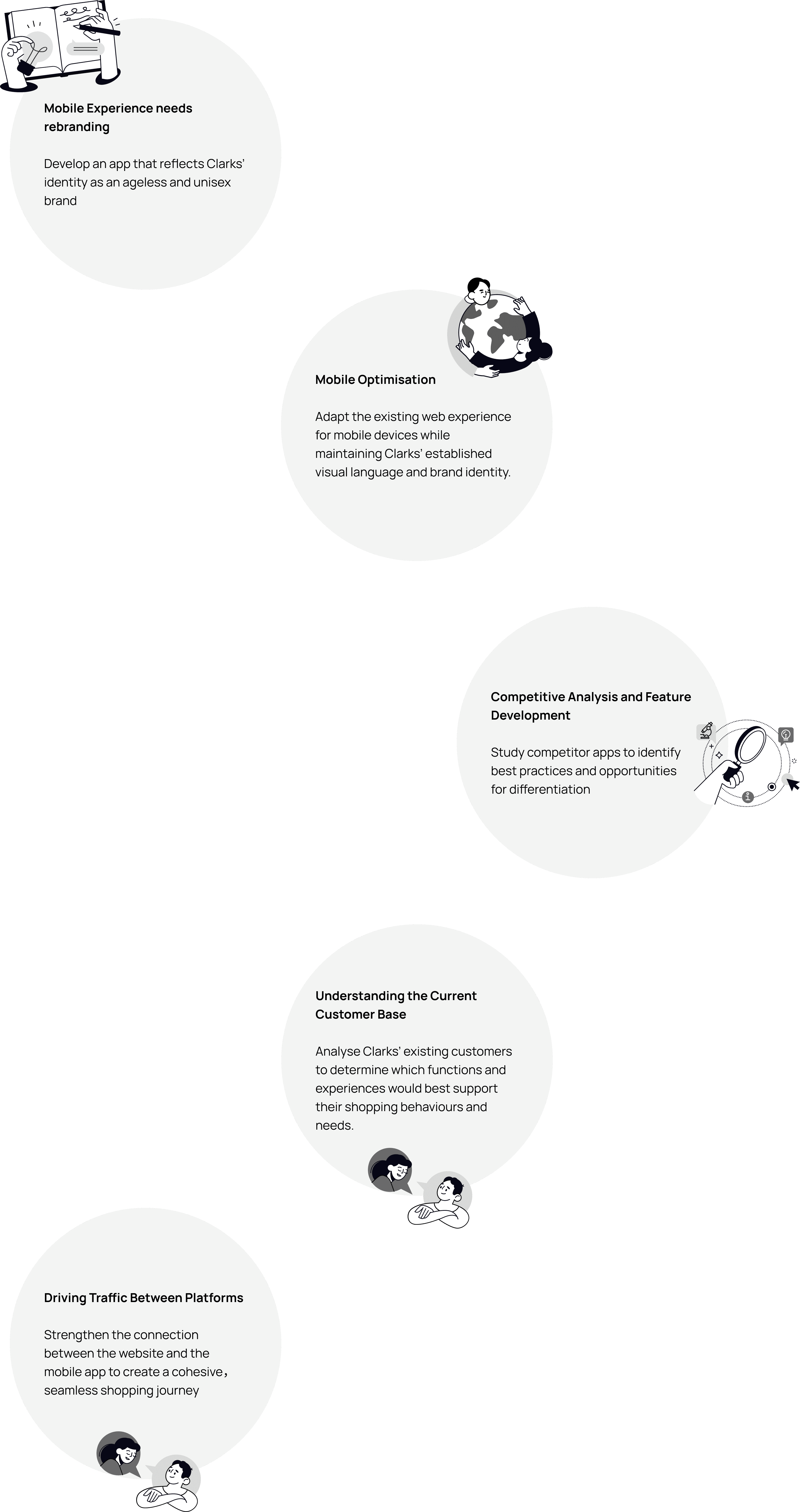
To address these issues, Clarks aims to study competitor platforms and identify opportunities to enhance the mobile experience through improved functionality and new features.

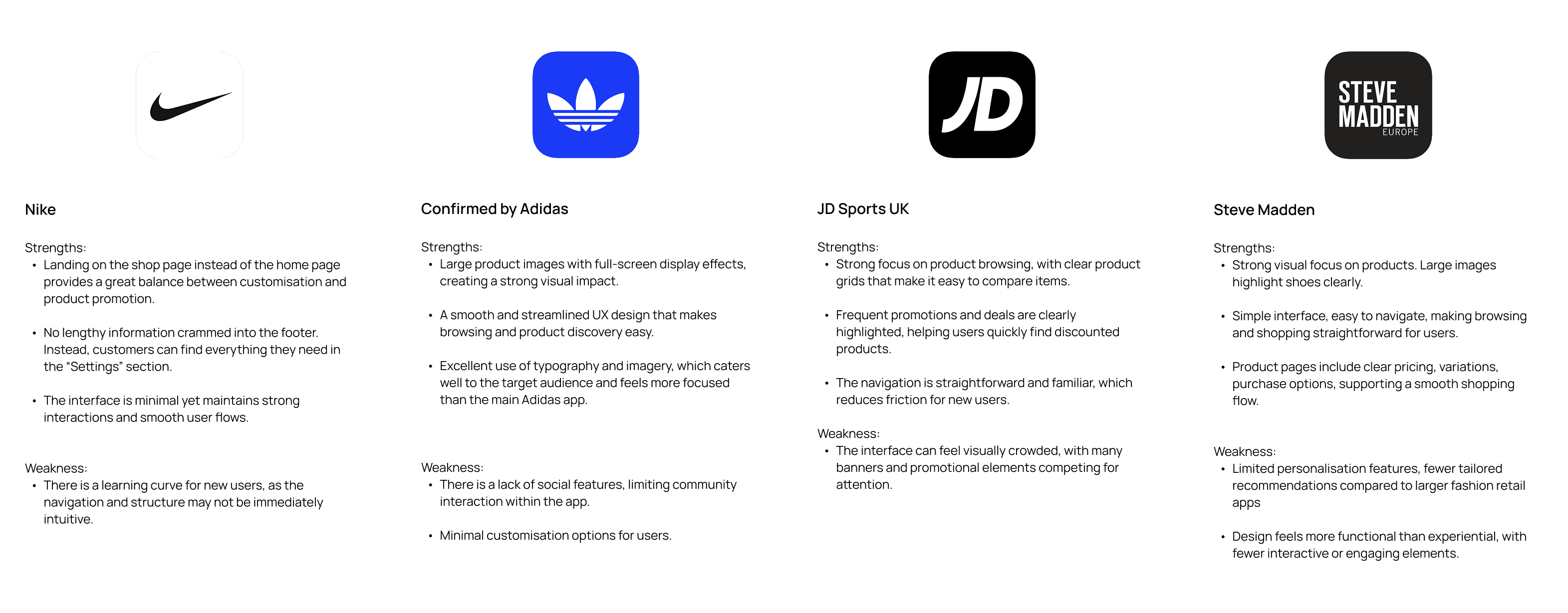
Since Clarks already knew their demography, my research was focusing on the existing brands , and what Clarks already have across web and other mobile platforms.
Competitor Research
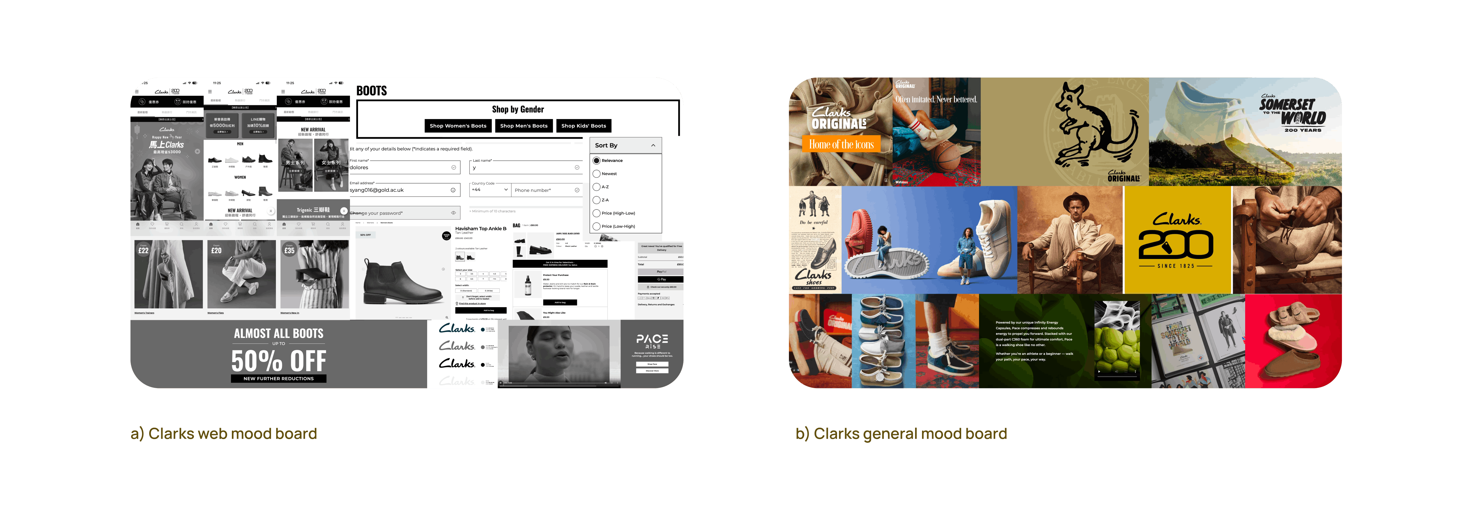
Mood Boards
The research highlighted that Clarks’ current website experience lacks mobile optimisation, long-term cart retention, and personalised engagement, which can interrupt the customer journey. In order to fix them, I've come down to these ideas-

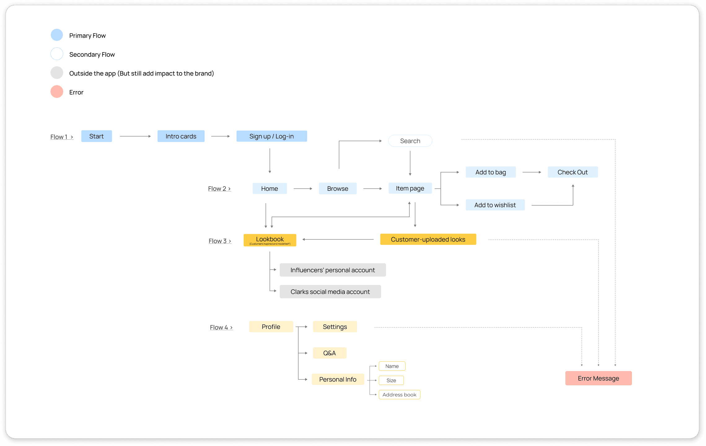
To address the identified challenges, we propose the development of a dedicated Clarks mobile app that offers a more personalised and private shopping experience for customers. The app will extend the existing web platform while creating a space where users can explore products, discover styling inspiration, and engage more closely with the brand.
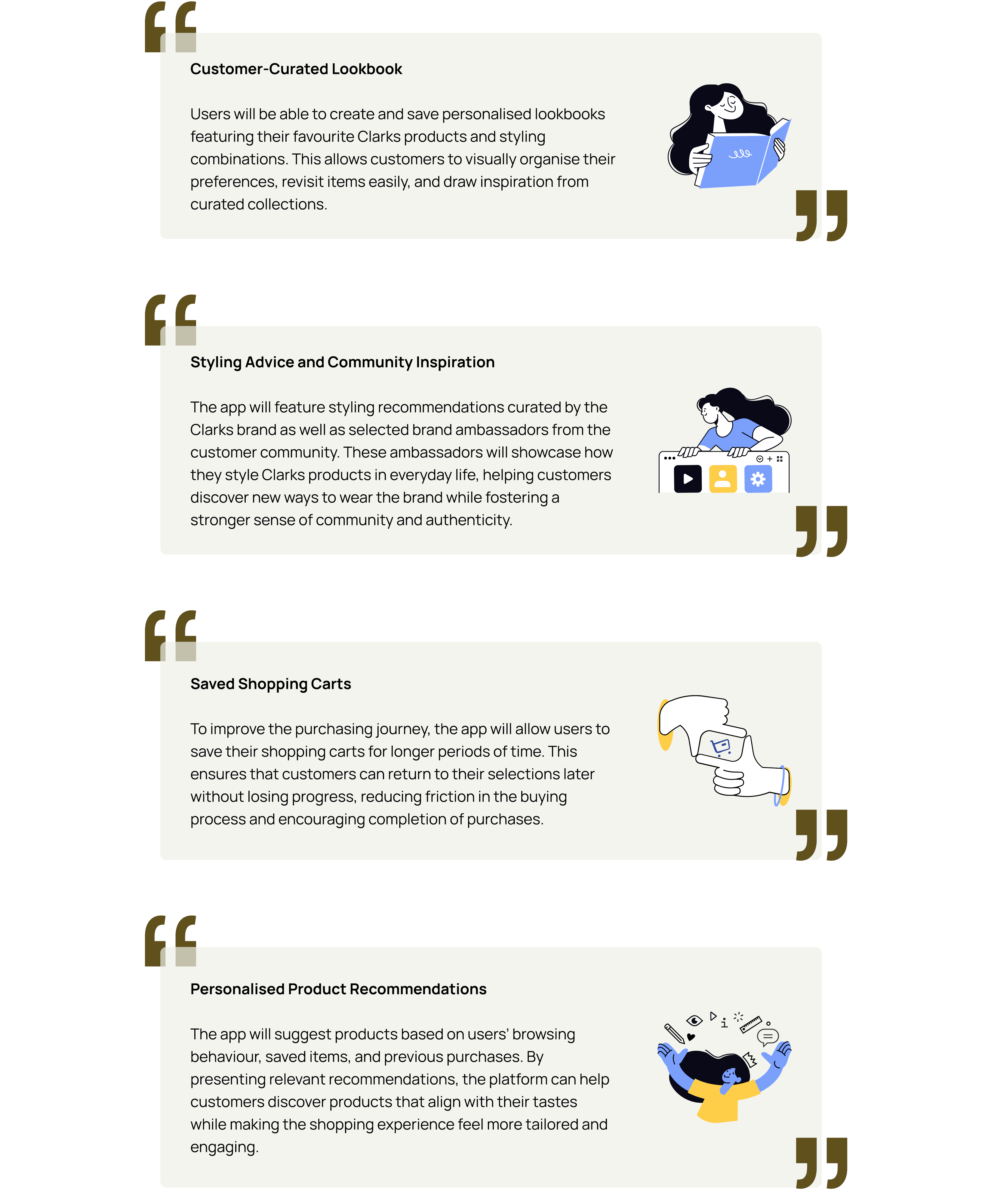
The mobile app will introduce several key features designed to enhance customer interaction and strengthen brand connection:

Design Process
The first step was to determine how to organise the system while drawing inspiration from the existing Clarks design language. I focused on the Clarks website, using its established elements- such as typography, colour palette, and border styles- as a foundation. I also referenced the Clarks app (overseas version for Taiwan) to broaden my understanding of their design approach.
Refining the idea
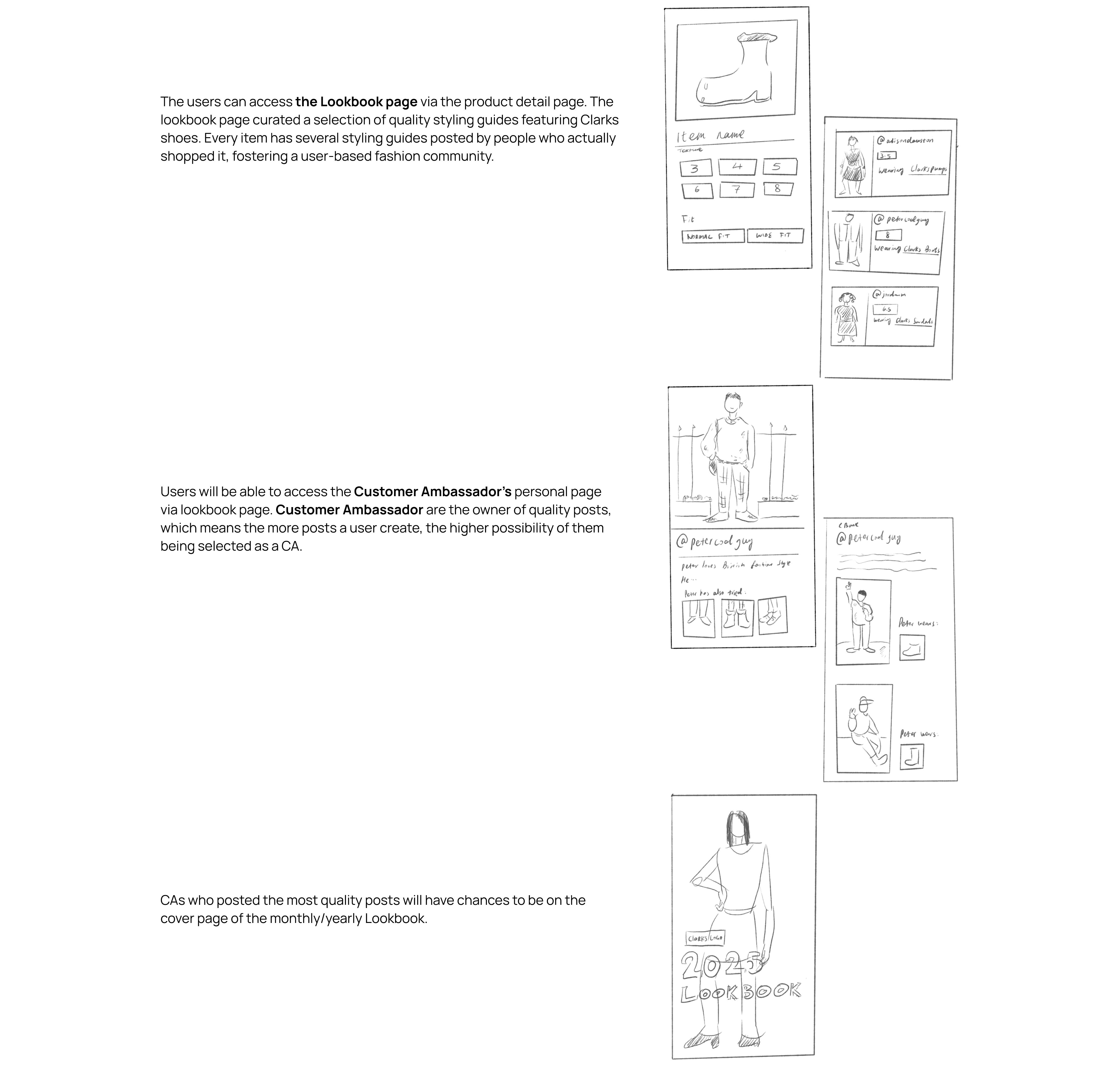
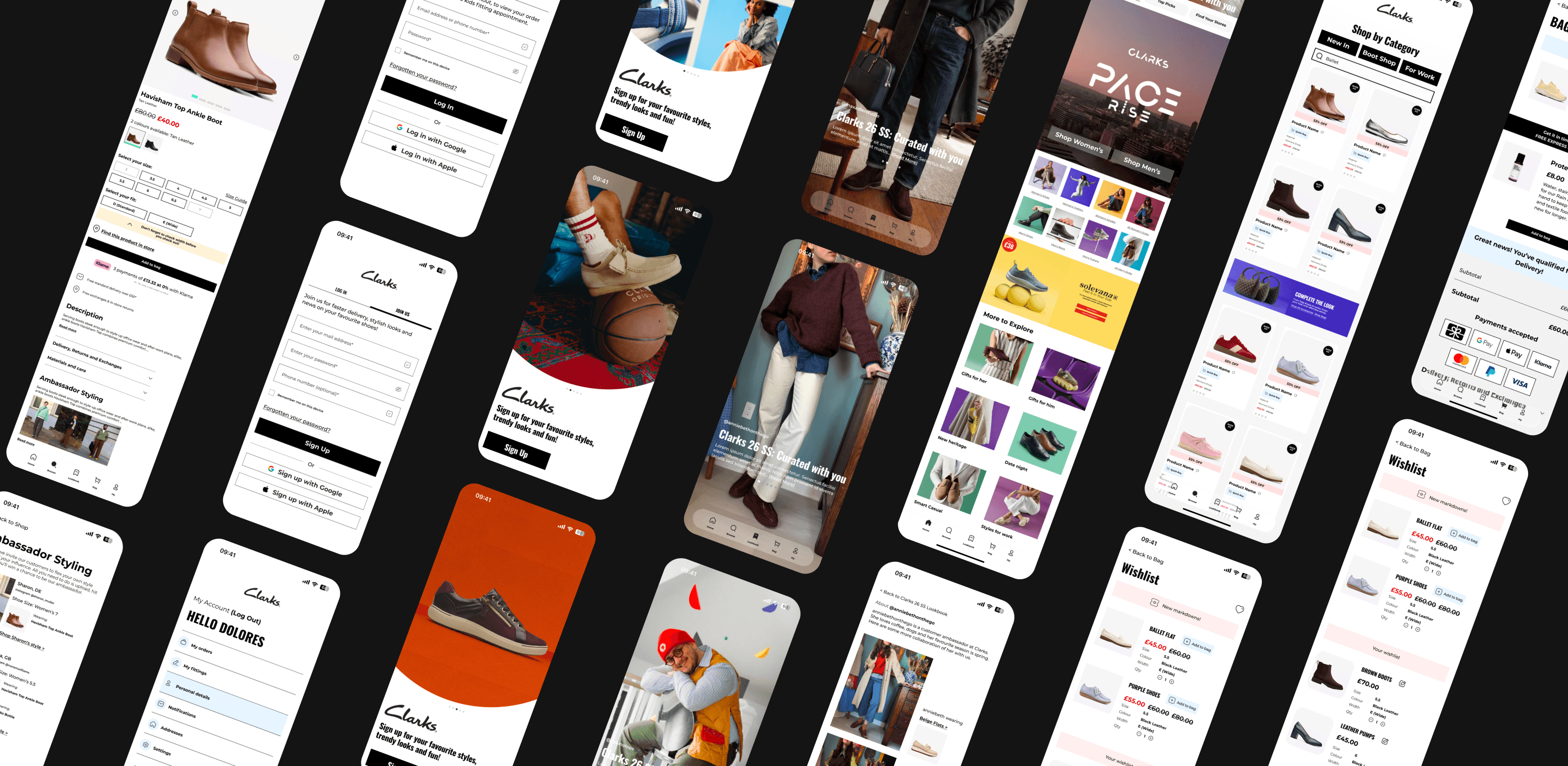
The customer forum is something I want to highlight for this project.
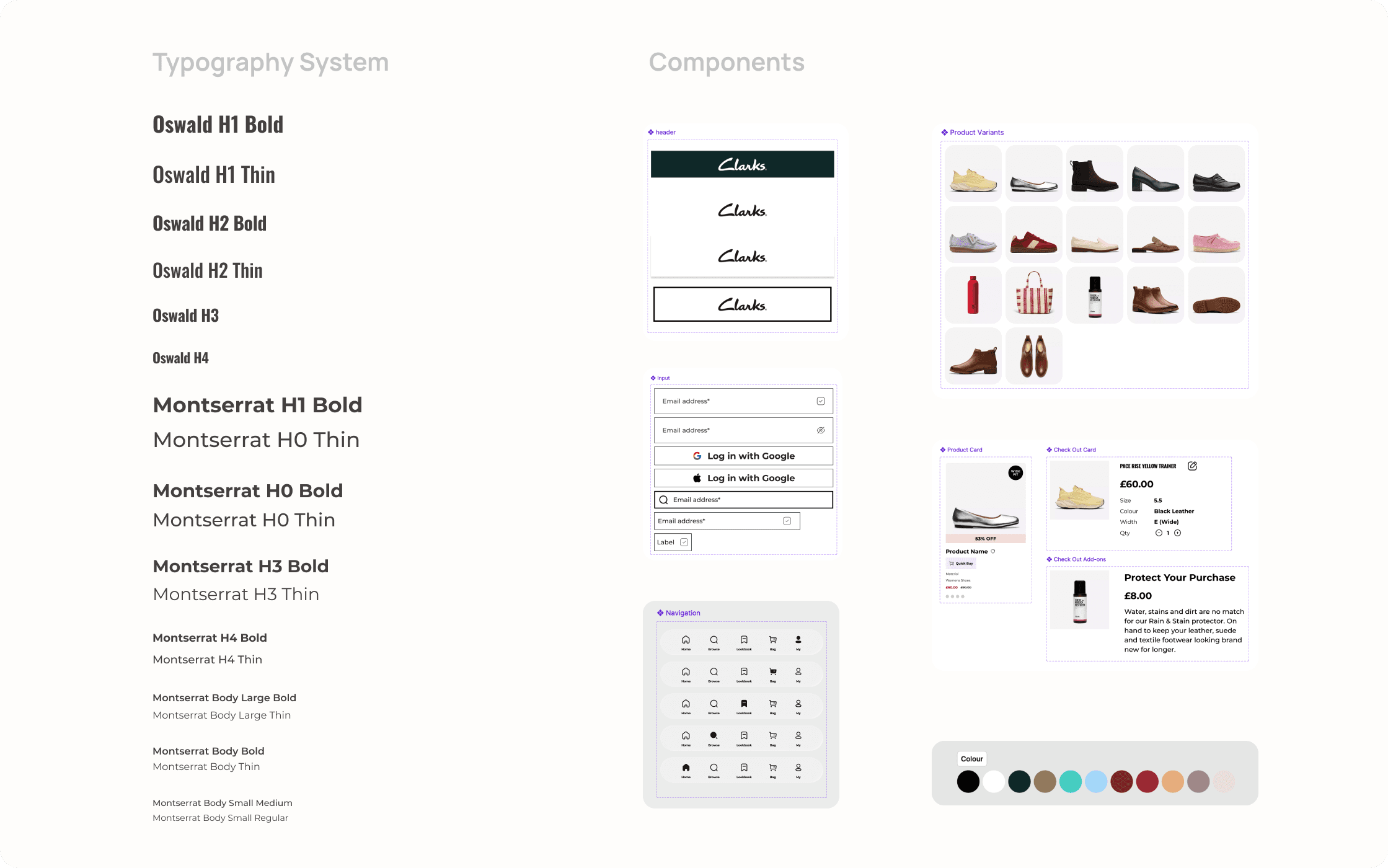
Knitting the details
The typography is structured around font weights to provide greater flexibility and findability during development. In making design decisions, I aimed to ensure that both the typography and colour palette were quick to use and intuitive, supporting a more efficient design and development workflow.
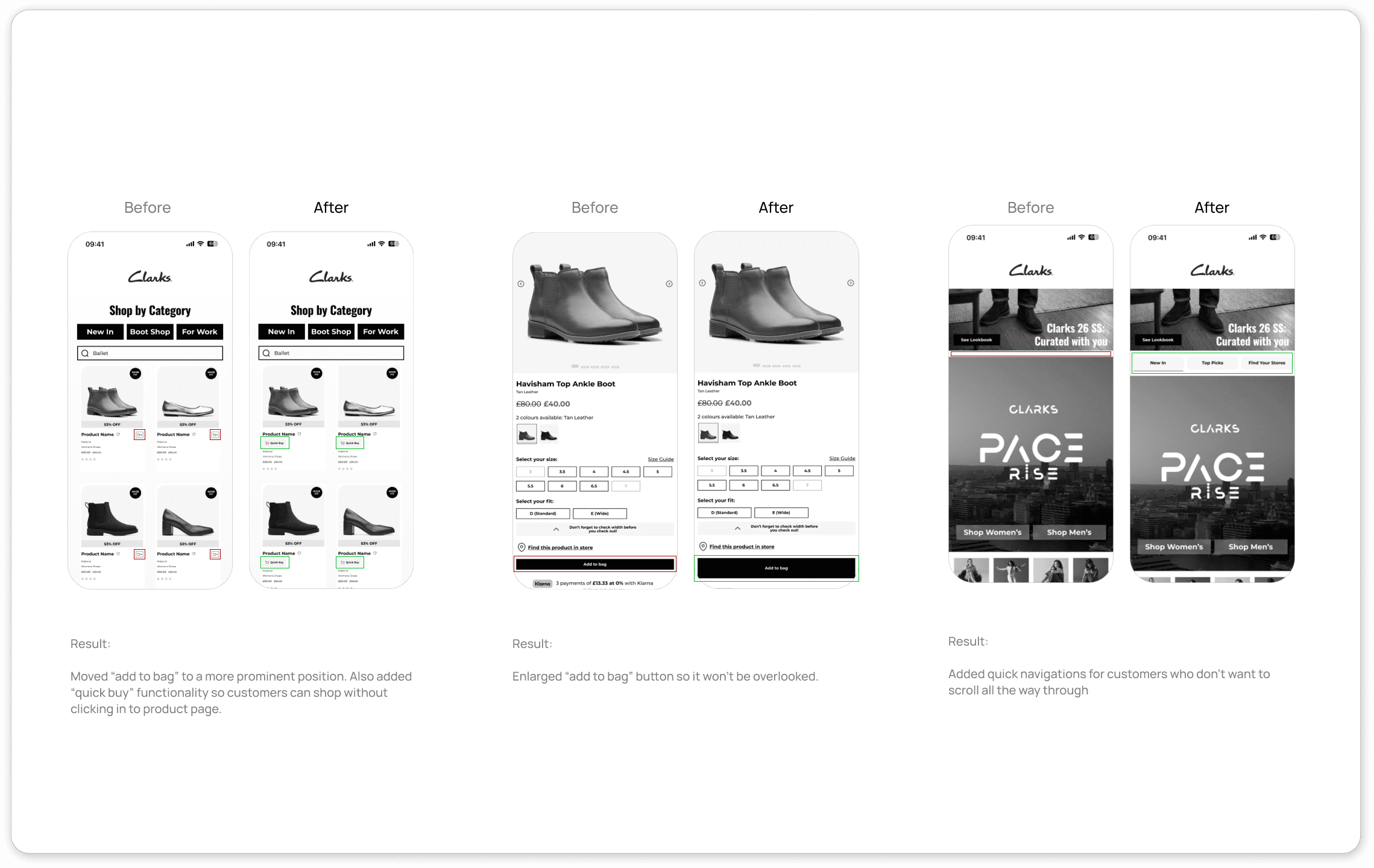
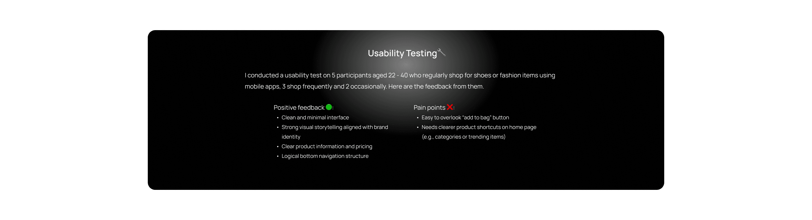
Good things need to be tested early
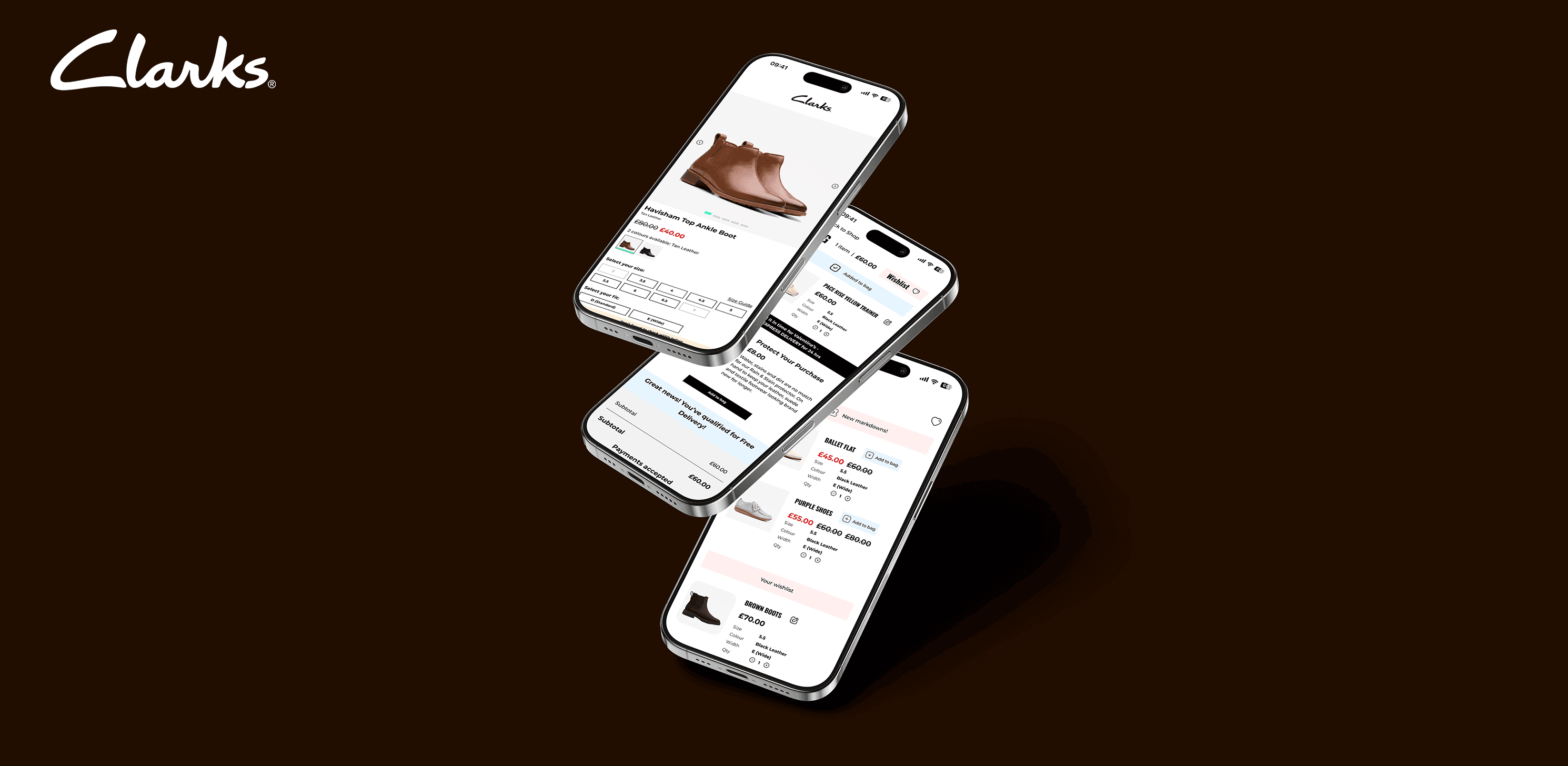
In order to test the usability, I mocked some screens based on the draft and have 15 potential users tested it. The goal was to
complete a purchase seamlessly
find a style guide feature in the Lookbook page
and here are the amends I made addressing the feedback:


01
02
03

04

